
8 Visual Learning Strategies to Boost Corporate Training


In the competitive corporate environment, traditional training methods often fail to deliver. Employees are frequently overwhelmed by dense text and static presentations, leading to disengagement and poor knowledge retention. The core issue isn't the content; it's the delivery. To drive real business results, learning and development must pivot to methods that align with how people naturally process information. This means embracing a more visual approach.
This article provides a curated collection of eight powerful visual learning strategies specifically designed for modern corporate training. We will move beyond basic slide decks to explore actionable techniques that make learning more engaging, memorable, and effective. You will discover practical ways to implement everything from dynamic mind maps and data visualizations to interactive video scenarios that boost comprehension and performance.
Each strategy is presented with practical implementation details and corporate-focused examples to help you transform your training programs. Whether you're an L&D manager, an instructional designer, or a sales leader, these methods will equip you to capture attention, improve skill acquisition, and demonstrate a clear return on your training investment. Let’s dive into the techniques that will overhaul your corporate learning experiences.
1. Interactive Video Training Scenarios
Passive video lectures are a relic of outdated corporate training. To truly engage employees and solidify complex skills, one of the most powerful visual learning strategies is deploying interactive video training scenarios. Instead of simply watching a presentation, learners actively participate in simulated, real-world situations where their decisions directly influence the outcome.
This method transforms training from a one-way broadcast into a dynamic, two-way conversation. Using interactive video platforms like Mindstamp, you can embed choice-based branching paths, clickable hotspots, and in-video questions directly into the footage. This active participation is ideal for mastering complex procedures, nuanced soft skills, and critical compliance protocols, as it forces learners to apply knowledge in the moment rather than just passively absorb it.
Practical Applications and Scenarios
This strategy excels in situations where decision-making under pressure is a key competency. The goal is to create a safe environment for employees to practice and fail without real-world consequences.
- Sales Enablement: A trainee navigates a conversation with a simulated client, choosing responses to objections. The video branches to show the immediate outcome of their choice, whether it's building rapport or losing the deal.
- Compliance & Safety: An employee is presented with a potential data breach or a workplace safety hazard. They must click on the correct elements on screen or choose the right procedural step, receiving instant feedback on their compliance knowledge.
- Leadership Development: A new manager practices a difficult conversation with a direct report, selecting dialogue options that demonstrate empathy, clarity, and effective conflict resolution skills.
How to Implement This Strategy
To maximize the effectiveness of interactive video, focus on structured design and measurable outcomes. Your goal is to create an experience, not just a video.
Key Insight: The power of interactive video lies in its ability to connect choices with immediate, visible consequences. This direct feedback loop accelerates learning and improves long-term retention far more effectively than a traditional quiz.
Start by defining a single, clear learning objective for each scenario. From there, storyboard the branching paths, ensuring that both correct and incorrect choices lead to realistic and instructive consequences. Platforms like Mindstamp simplify this process, allowing creators to link video segments and add interactive elements without complex coding. Once deployed, use analytics to track where learners hesitate or frequently choose incorrect paths, revealing specific knowledge gaps that need reinforcement.
By immersing employees in these controlled, true-to-life challenges, you provide a memorable and highly effective learning experience. For a deeper dive into the mechanics, you can learn more about how to create interactive video content.
2. Concept Mapping
While many visual tools help brainstorm ideas, concept mapping stands out as one of the most structured and powerful visual learning strategies for understanding complex corporate systems. Unlike a mind map that radiates from a single center, a concept map illustrates the intricate relationships between multiple ideas. It uses nodes (concepts) connected by labeled arrows or lines (linking words) to build a logical, hierarchical framework of knowledge.
This method forces the learner to move beyond simple memorization and actively construct a web of interconnected information. By defining the precise relationship between each concept (e.g., "causes," "leads to," "is composed of"), employees build a deeper, more nuanced understanding. This makes concept mapping an exceptional tool for clarifying complex business processes, organizational structures, and strategic frameworks in a corporate training environment.
Practical Applications and Scenarios
Concept mapping is ideal for situations where learners need to see the "big picture" and understand how individual components fit together. It helps deconstruct complexity and reveal hidden connections.
- Corporate Knowledge Management: A team can map out an entire project workflow, showing how different departments, tasks, and software systems are interconnected. This visual guide serves as a single source of truth for new and existing employees.
- Technical Training: A new software engineer can create a concept map to document an application's architecture, linking modules, databases, and APIs to understand how data flows through the system.
- Onboarding and Role Clarity: An HR department uses a concept map to illustrate an employee's role, connecting their key responsibilities to specific departmental goals and the broader company mission.
How to Implement This Strategy
Effective concept mapping begins with a clear focus and a systematic approach. The goal is to create a logical and accurate representation of a knowledge domain.
Key Insight: The true learning in concept mapping happens during the construction process. The act of identifying key concepts and articulating the exact relationship between them is what solidifies understanding and reveals knowledge gaps.
Start with a guiding "focus question" to define the map's boundaries, such as "How does our new compliance protocol work?" Identify the 10-15 most critical concepts related to this question and arrange them hierarchically, from general to specific. Use concise, descriptive linking words on the connecting lines to define each relationship. The infographic below illustrates the core principles that give concept mapping its structure.
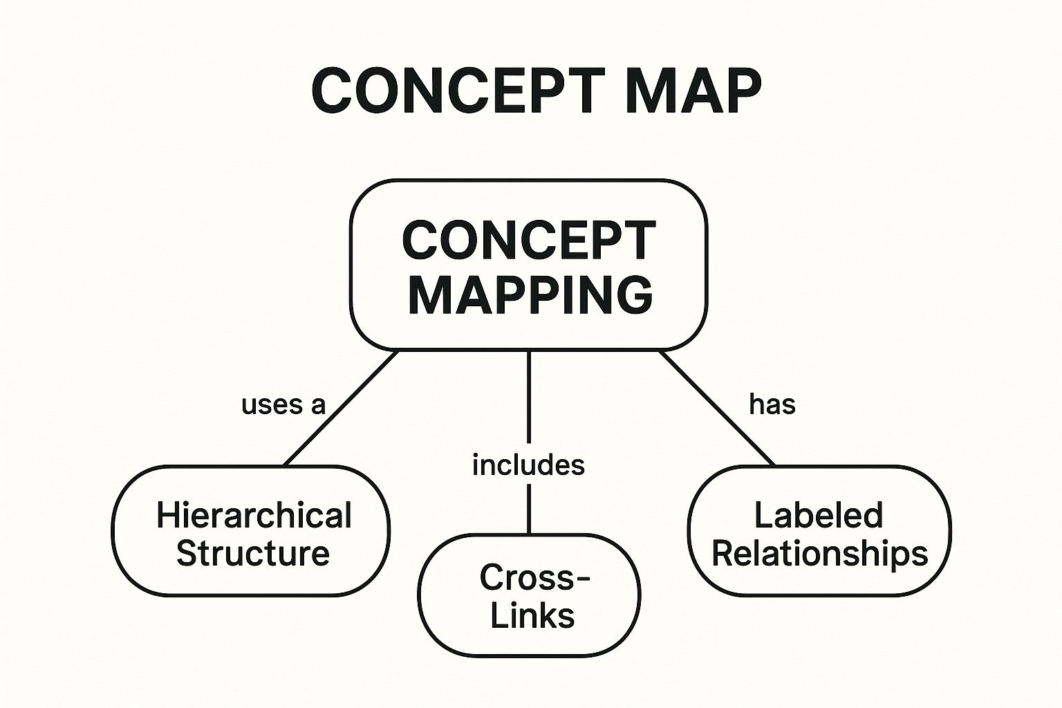
As shown, the map's strength comes from its defined structure, labeled relationships, and the ability to form cross-links between different conceptual areas. Finally, review the map to find and draw cross-links between different branches to illustrate more complex interdependencies, turning a simple chart into a rich network of knowledge. Platforms like Lucidchart or Cmaptools can facilitate this process digitally.
3. Infographics
In the world of corporate training, where complex data and dense procedural information are common, infographics stand out as a premier visual learning strategy. They transform complicated statistics, processes, and concepts into a visually compelling narrative that is easy to scan and remember. By strategically combining icons, charts, concise text, and branded graphics, infographics make learning more efficient and engaging.
This method moves beyond simple text-based documents or lengthy presentations, offering a high-impact, single-page summary. For busy professionals, this format is especially powerful because it organizes information spatially, allowing them to see connections and hierarchies at a glance. It's an ideal tool for breaking down multifaceted topics into a digestible and shareable asset.

Practical Applications and Scenarios
Infographics are exceptionally versatile and can be deployed across various departments to clarify complex information and reinforce key messages. The goal is to make critical data accessible and memorable.
- Employee Onboarding: An infographic can visually map out a new hire’s first 90 days, outlining key milestones, training modules, and departmental contacts in an easy-to-follow format.
- Compliance & Safety Training: A complex workplace safety protocol or a multi-step data security process can be illustrated as a clear, step-by-step visual guide, reducing ambiguity and improving adherence.
- Reporting & Analytics: Instead of a dense report, learning and development teams can present training program results through an infographic, highlighting key metrics like completion rates, assessment scores, and employee feedback.
How to Implement This Strategy
Effective infographics prioritize clarity and a singular focus. Their design should guide the learner's eye through a logical flow, telling a story with data. Your objective is to simplify, not just decorate.
Key Insight: The true value of an infographic is its ability to synthesize complex information into a single, cohesive visual story. This makes dense topics approachable and significantly boosts knowledge retention with minimal cognitive load.
Begin by identifying one core message or key takeaway you want to communicate. Use a consistent brand color scheme and a limited set of fonts to maintain visual harmony. Balance your visuals with minimal text, using data visualizations like charts and graphs to do the heavy lifting. For an even greater impact, you can embed infographics within video training to combine visual storytelling with active engagement.
4. Flowcharts and Diagrams
When a process involves multiple steps, decision points, and potential outcomes, text-based instructions can become confusing and overwhelming. To bring clarity to complex workflows, one of the most effective visual learning strategies is the use of flowcharts and diagrams. These tools translate intricate procedures into clear, logical, and easy-to-follow visual maps.
By using standardized symbols and directional arrows, flowcharts break down a system into its individual components. This allows employees to see not only each step in a sequence but also how those steps connect to one another. This systematic approach is invaluable for training on standard operating procedures (SOPs), technical processes, and any role requiring consistent, rule-based decision-making.
Practical Applications and Scenarios
This strategy is indispensable for roles where procedural accuracy is critical. Flowcharts remove ambiguity and create a single source of truth for how a process should be executed, ensuring consistency and quality across teams.
- Manufacturing & Quality Control: A new technician follows a diagnostic flowchart to troubleshoot a piece of equipment, with each step guiding them based on test results, ensuring a standardized and efficient repair process.
- Customer Service Protocols: A support agent uses a diagram to navigate a customer complaint, with branches for different issue types (e.g., billing, technical), leading them to the correct resolution path.
- Software Development: A project manager presents a workflow diagram to stakeholders, illustrating the user journey from login to purchase, ensuring everyone understands the functional requirements.
How to Implement This Strategy
Effective diagrams prioritize clarity and logic over exhaustive detail. The goal is to simplify a complex process, not to document every single exception. For those interested in exploring various methods, researching top data visualization techniques can offer valuable insights into presenting complex information clearly.
Key Insight: The true power of a flowchart isn't just showing the steps; it's visualizing the decision points. By clearly marking where choices must be made and what the consequences are, you empower employees to think critically and act confidently within a defined framework.
Begin by identifying the start and end points of the process you want to document. Use standardized symbols for actions, decisions, and outcomes to maintain clarity. Keep the text within each symbol brief and action-oriented. Crucially, test the flowchart by having someone unfamiliar with the process follow it; their questions and stumbling points will reveal where your diagram needs more detail or simplification.
5. Graphic Organizers
Moving beyond passive information intake, graphic organizers serve as structured visual frameworks that empower employees to process, connect, and synthesize complex business information. As a core component of effective visual learning strategies, these tools transform abstract concepts into tangible, organized diagrams. Instead of confronting a dense block of text, employees can use pre-designed templates like Venn diagrams, flowcharts, and mind maps to structure their thinking and clarify relationships between ideas.
This method actively engages learners by requiring them to categorize information, identify cause-and-effect relationships, or map out procedural steps. It bridges the gap between seeing information and truly understanding it. In a corporate setting, this is invaluable for breaking down intricate business processes, company hierarchies, or complex project workflows into manageable, easy-to-digest components, ensuring deeper comprehension and retention.
Practical Applications and Scenarios
Graphic organizers are exceptionally effective for deconstructing complex systems and helping employees see the bigger picture. They provide a blueprint for thinking, which is critical for both onboarding and ongoing professional development.
- Onboarding: A new hire uses a flowchart to map the company’s multi-stage client intake process, clarifying each step, key decision point, and responsible department.
- Process Improvement: A team uses a cause-and-effect (fishbone) diagram to brainstorm potential reasons for a recent dip in customer satisfaction, organizing ideas into categories like "People," "Process," and "Technology."
- Strategic Planning: A project manager creates a mind map to outline all the moving parts of a new product launch, visually connecting marketing tasks, development milestones, and sales goals.
How to Implement This Strategy
To use graphic organizers effectively, the key is to match the tool to the specific learning objective. The goal isn't just to fill in boxes; it's to facilitate a structured thought process that leads to clarity.
Key Insight: Graphic organizers act as a mental scaffold, providing a clear structure that helps employees build complex knowledge independently. They turn the passive act of reading into an active process of organization and analysis.
Start by selecting an organizer that directly aligns with your training goal; for example, use a T-chart for comparing pros and cons or a sequence chart for procedural training. Initially, model how to complete the organizer with a familiar topic before asking employees to use it for new material. Encourage teams to use digital whiteboarding tools to collaborate on organizers during virtual meetings, fostering shared understanding and turning individual knowledge into a collective asset.
6. Visual Note-Taking and Sketchnoting
Traditional linear note-taking often fails to capture the dynamic flow of information in a fast-paced business environment, leading to passive listening and poor retention. As a more effective alternative, visual learning strategies like sketchnoting transform information capture into an active, engaging process. This method involves combining handwritten text with drawings, symbols, connectors, and other visual elements to create a non-linear map of ideas.
Instead of just transcribing words, learners actively process and synthesize information by deciding how to represent it visually. This dual-coding approach, engaging both verbal and visual channels in the brain, dramatically improves comprehension and long-term memory. Popularized by experts like Mike Rohde, this technique turns passive note-taking into an act of creative synthesis, making complex business concepts more digestible and memorable.

Practical Applications and Scenarios
Sketchnoting is highly adaptable and excels in corporate environments where information is delivered quickly and needs to be synthesized on the spot. It encourages active listening and helps identify connections between different topics.
- Corporate Training & Workshops: Employees can sketchnote during a training session or workshop to map out new processes, leadership concepts, or software workflows, creating a personalized and memorable learning artifact.
- Live Presentations & Webinars: Attendees capture key takeaways from a conference presentation or webinar, creating a one-page visual summary that is far easier to review than pages of linear text.
- Strategic Planning Meetings: A facilitator or team member uses sketchnoting to visually map out brainstorming sessions, project plans, or strategic discussions, ensuring all ideas are captured and interconnected.
How to Implement This Strategy
The barrier to entry for sketchnoting is low, as it prioritizes clear communication over artistic skill. The focus is on capturing ideas, not creating a masterpiece.
Key Insight: Sketchnoting isn't about being an artist; it's about being a visual thinker. The act of translating concepts into simple drawings and diagrams forces a deeper level of cognitive processing, which is the foundation for enhanced retention.
To begin, encourage employees to start simple by developing a personal library of basic icons and symbols for common business concepts like "goal," "idea," or "process." Emphasize capturing main ideas and their relationships rather than every detail. Use visual hierarchy techniques, like making key concepts larger or boxing them, to guide the eye. Over time, this practice builds a powerful skill for distilling and retaining complex information in any professional setting.
7. Interactive Multimedia Presentations
Static, slide-by-slide presentations often fail to hold an employee's attention, leading to poor knowledge retention. One of the most versatile visual learning strategies is the use of interactive multimedia presentations, which transform passive viewing into an active learning experience. These presentations integrate various media types-including text, video, audio, and images-with clickable elements and embedded activities.
This approach empowers learners by giving them control over their professional development journey. Instead of being led through a linear sequence, users can explore content at their own pace, click on hotspots for deeper insights, and engage with embedded quizzes or simulations. This interactivity is highly effective for breaking down complex information into digestible, engaging modules that cater to different learning preferences and reinforce key concepts through direct participation.
Practical Applications and Scenarios
This strategy is exceptionally effective for corporate training and onboarding, where a mix of information types needs to be delivered in a scalable and engaging format. It allows for a rich, self-directed learning environment that can be deployed across an entire organization.
- Employee Onboarding: A new hire navigates an interactive module that covers company history, culture, and departmental roles. They can click on team member photos to see video introductions or complete short quizzes to check their understanding of company policies.
- Product Knowledge Training: A sales team explores a new product through a presentation featuring 3D models, video demonstrations of key features, and clickable callouts that reveal technical specifications.
- Software & Systems Training: An employee learns a new software application by following an interactive tutorial with screen recordings and "click-to-proceed" prompts that simulate the actual user interface, ensuring they can apply the steps correctly.
How to Implement This Strategy
To create a successful interactive presentation, the focus should be on purposeful engagement rather than just adding clickable elements for their own sake. Every interactive component should serve a clear learning objective.
Key Insight: The true advantage of interactive multimedia presentations is their ability to layer information. Learners can access a high-level overview and then choose to dive deeper into specific topics that are relevant to them, creating a personalized and efficient learning path.
Begin by storyboarding the entire experience, mapping out the main navigation and identifying where interactive elements will add the most value. Balance the media types to avoid cognitive overload and ensure the presentation is accessible and performs well on various devices. Provide clear instructions and navigation cues so learners always know how to proceed.
By creating these dynamic and multi-layered experiences, you offer a powerful alternative to traditional lectures. To get started, you can explore guides on how to create interactive presentations that capture and hold audience attention.
8. Data Visualization and Charts
Raw spreadsheets and dense data tables often overwhelm employees, making it difficult to extract meaningful insights. One of the most effective visual learning strategies for corporate training is using data visualization and charts. This approach transforms complex quantitative information into accessible visual formats like graphs, heat maps, and dashboards, allowing employees to quickly identify trends, patterns, and correlations that would otherwise be lost in text.
By presenting performance metrics, survey results, or market data visually, you turn abstract numbers into a tangible story. This strategy is essential for any training that involves analytics, financial literacy, or performance management. It allows learners to see the impact of their work and understand key business drivers at a glance, fostering a more data-informed culture across the organization.
Practical Applications and Scenarios
Data visualization is ideal for making data-driven decision-making a core competency. It helps employees understand the "why" behind business objectives and their role in achieving them.
- Performance Management: A sales team reviews a dashboard visualizing their quarterly performance against targets, with charts showing individual contributions, lead conversion rates, and regional trends.
- Business Intelligence Training: New analysts learn to interpret company-wide KPIs through interactive dashboards, clicking on different segments to drill down into specific departmental data.
- Operational Efficiency: A logistics manager uses a heat map to show warehouse picking inefficiencies, making the case for a new process flow that employees can easily understand and support.
How to Implement This Strategy
Effective data visualization prioritizes clarity and context over complexity. The goal is to illuminate, not to impress with flashy but confusing graphics.
Key Insight: The true value of data visualization is its ability to translate raw data into an immediate, intuitive understanding. A well-designed chart can convey a complex insight in seconds, which might take pages of text to explain.
Begin by identifying the single most important message you want the data to convey. Choose the appropriate chart type for your data (e.g., bar charts for comparison, line charts for trends over time). Use clear labels, a logical color scheme, and remove any "chart junk" like unnecessary gridlines or 3D effects. Always provide context to help learners interpret what they are seeing and understand the business implications.
By making data accessible and engaging, you empower employees to think critically and make better-informed decisions. You can even embed these charts into training videos to provide dynamic context; to learn how, see more on how to create interactive video content.
Visual Learning Strategies Comparison Matrix
Making Visual Learning Your Corporate Superpower
We've explored a powerful arsenal of visual learning strategies, from the structured logic of concept maps and flowcharts to the compelling narrative of infographics and the dynamic engagement of interactive video. Each technique serves a unique purpose, yet they all share a common, foundational principle: they align with the brain's natural preference for processing visual information. Moving beyond traditional, text-heavy training manuals is no longer a novelty; it is a strategic imperative for modern corporate L&D.
Integrating these methods transforms passive information consumption into active, participatory learning. When a sales team member can navigate an interactive product demo rather than just reading about its features, or a new hire can visualize a complex workflow through a clear diagram, the learning becomes sticky. The goal is not just to present information but to create cognitive connections that lead to genuine understanding and long-term retention.
Key Takeaways for Immediate Impact
To truly harness the power of these visual learning strategies, it's essential to move from theory to application. Remember these core principles as you begin to reshape your training content:
- Clarity Over Clutter: The effectiveness of a visual aid, whether it's a data visualization chart or a concept map, is determined by its clarity. Prioritize conveying a single, core idea effectively over cramming too much information into one graphic. A simple, well-designed flowchart is infinitely more useful than a complex, confusing one.
- Interaction Drives Retention: Passive viewing leads to fleeting memory. Strategies like interactive video fundamentally change the learning dynamic. By prompting learners to click, answer questions, or choose their own path, you turn them into active participants, significantly boosting engagement and recall.
- Context is Everything: Visuals are most powerful when they are directly relevant to the learner's role and challenges. An infographic detailing company-wide performance metrics is useful, but an interactive chart allowing a marketing professional to drill down into their specific campaign data is transformative.
Your Action Plan for a More Visual L&D
Embarking on this visual transformation doesn't require a complete overhaul overnight. The key is to start small and build momentum. Select one high-priority training module-perhaps a complex compliance procedure or a new software rollout-and challenge yourself to convert a key section using one of the techniques discussed.
Could that dense, multi-page process document become an intuitive, step-by-step flowchart? Could that standard onboarding video be enhanced with clickable hotspots and embedded questions to verify comprehension in real-time? By taking an incremental approach, you can measure the impact, gather feedback, and demonstrate the value of these visual learning strategies to stakeholders, paving the way for broader adoption across your organization. Ultimately, you are building a more agile, competent, and engaged workforce prepared to excel.
Ready to transform your passive training videos into active learning experiences? Mindstamp makes it easy to add interactive elements like questions, buttons, and branching logic directly into your existing video content. See for yourself how our platform can elevate your visual learning strategies by starting your free trial at Mindstamp today.
Get Started Now
Mindstamp is easy to use, incredibly capable, and supported by an amazing team. Join us!


Try Mindstamp Free


