
Create image buttons: Boost Engagement in Corporate Training Videos


You can create image buttons by nesting an <img> tag inside a link, or you could style a <button> element with a CSS background image. But for interactive video platforms like Mindstamp, it's even simpler. You can add clickable image overlays directly to your training content, turning passive videos into active learning experiences that boost knowledge retention and engagement.
Why Visual Buttons Are a Game Changer in Corporate Training
In the learning and development (L&D) world, engagement is everything. It's the key to making sure critical knowledge actually sticks. Traditional training videos, where employees passively watch a presentation, often miss the mark. Attention wanders, and key information is lost.
This is where creating image buttons can completely transform your training strategy.
By embedding simple, clickable images right into your video content, you shift the learner from being a passive observer to an active participant. It seems like a small tweak, but it has a massive impact on how information is processed and remembered, making your corporate training more effective.
Fostering Active Learning and Self-Direction
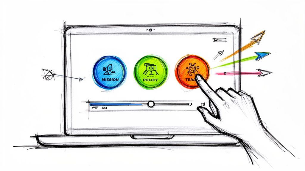
Picture an onboarding video for a new hire. Instead of a linear, 30-minute lecture, the video kicks off with a main menu. It has clean, intuitive image buttons for 'Our Mission,' 'Key Policies,' and 'Meet Your Team.' New employees can jump to what's most relevant to them first, personalizing their own learning path right from the get-go.
This self-directed approach unlocks some serious advantages for corporate training:
- It reduces cognitive overload. Breaking down complex topics like compliance or new software into smaller, selectable modules stops employees from feeling overwhelmed. Learners can digest the content at their own speed.
- It boosts engagement. Interactivity is a natural focus-booster. When learners know they have choices to make, they automatically pay closer attention to the training material.
- It improves knowledge retention. Study after study shows that active participation leads to better memory recall. Simply clicking a button to explore a topic is a form of active learning that reinforces key concepts.
This shift from passive watching to active doing is the core of better training outcomes. It’s not about adding gimmicks to make videos more fun; it’s about making them more effective at building real skills and understanding.
From Theory to Measurable Results
The benefits go way beyond just a better learning experience. When you create image buttons inside an interactive video platform like Mindstamp, every single click can be tracked and analyzed.
This provides L&D professionals with invaluable data on which training topics are resonating, where employees might be getting stuck, and how well the material is actually landing. If you're looking to explore this further, our guide on how to create interactive video is a great next step.
Ultimately, adding visual buttons transforms a standard training video into a powerful, data-driven learning tool. You'll see measurable improvements in completion rates, higher scores on comprehension checks, and a more skilled, confident workforce. That makes a compelling case for bringing this strategy into your own corporate training program.
How to Create Accessible Image Buttons with HTML and CSS
When you're building a custom learning portal or a new training module, you’ll eventually need to create image buttons. Your core toolkit for this is HTML and CSS. The real goal here isn't just making something that looks good, but building an experience that works for everyone, including employees using assistive tech like screen readers.
A common shortcut is to just wrap an <img> tag in an <a> tag. It’s quick, but this method often falls short on accessibility and doesn't offer much flexibility.
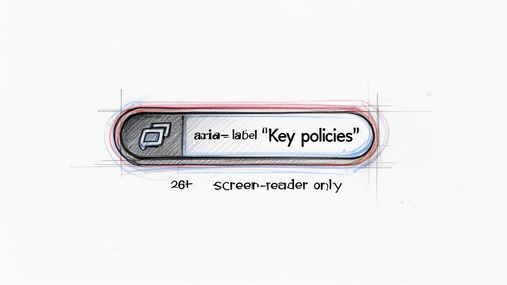
There’s a much better way: using the semantic <button> element. It's the professional approach because it comes with accessibility baked right in. It’s keyboard-navigable and tells screen readers "Hey, this is something you can interact with!" right out of the box. We’ll skip putting an image inside the button and instead use CSS to apply it as a background.
Building a Better Button
Let's get into the structure. We’ll start with a <button> element and assign it a class for styling. The most important piece is adding a <span> with text that clearly describes what the button does. This text will be hidden from sighted users but will be read aloud by screen readers, making it perfectly accessible.
For instance, imagine you need a button that links to safety procedures in a compliance module. The HTML would look something like this:
That "sr-only" class is a common utility class that hides content visually without removing it from the accessibility tree. This small detail is a game-changer for ensuring all employees, regardless of ability, can access your training content.
Styling with CSS for Visual Appeal and Interaction
Now for the design. We'll use CSS to strip away the browser's default button styles, define a size, and set our icon as the background. We also need to add :hover and :focus states. These provide crucial visual cues that the button is interactive, a cornerstone of effective instructional design.
A few key properties you'll use:
background-image: Points to your image file. SVGs are fantastic here because they scale beautifully.background-repeat: Always set tono-repeatso the image doesn't tile across the button.background-position: Usingcenterkeeps your icon perfectly aligned.:hover&:focus: These pseudo-classes let you change styles, like adding a subtle border or shifting the opacity, when an employee mouses over or tabs to the button.
Here's why this approach is so solid: it creates a "bulletproof" button. Even if the image fails to load, the button still works and makes sense. The screen reader will announce "View Safety Procedures," so the learner never loses context.
Getting these details right is part of following broader website accessibility best practices. And if you're working with more complex interactive elements, our guide on how to use HTML in your interactive videos has some great additional tips.
By pairing the semantic strength of the <button> element with smart CSS and accessible text, you're crafting an experience that’s both visually slick and universally usable. This method gives you a reliable, professional foundation for any custom interactive training content you need to build.
Go Vector with SVG for Razor-Sharp Buttons
When you’re building out training modules, the file format you pick for your image buttons really matters. It has a huge impact on both the visual polish and the learner's overall experience. Many people default to PNGs and JPGs, which are raster images. They're built from a fixed grid of pixels, meaning they can get blurry when scaled up on high-resolution screens. That's a quick way to make your professional training content look amateur.
There's a much better choice: Scalable Vector Graphics, or SVG.
Unlike raster files, SVGs are essentially XML code—a set of instructions for drawing a shape. This one difference is why they're the superior choice for icons and simple graphics, especially in a corporate learning environment.
The biggest win here is infinite scalability. An SVG button looks perfectly crisp and sharp whether an employee is viewing it on a large monitor or a small smartphone screen. This solves a huge design headache and guarantees a consistent, high-quality experience for every learner, no matter their device.
So, Why Are SVGs Better Than the Alternatives?
Beyond just looking professional, SVGs bring serious practical benefits to corporate training, where performance is key. Nobody wants to wait for a module to load. SVGs help you build faster, more engaging learning experiences.
Here's a quick rundown of the advantages:
- Tiny File Sizes: For simple icons, SVGs are almost always significantly smaller than their PNG or JPG equivalents. Lighter assets mean your training content loads in a snap.
- Better Performance: Faster load times create a smoother learning experience, which means you're less likely to lose employees to frustration before they even complete the training.
- Easy Customization: Since SVGs are just code, you can style them directly with CSS. You can change their color, size, or even add slick animations on hover without ever opening an image editor.
The ability to style SVGs with CSS is a total game-changer for L&D teams. Imagine creating one "next" arrow icon and then using a single line of CSS to change its color to match the branding for different departments. That kind of flexibility can save you an incredible amount of time and effort.
Using Inline SVGs to Create Dynamic Buttons
To really unlock the power of SVGs, you can embed them directly into your HTML. This is called using an "inline SVG," and it gives you complete control. By placing the SVG code right inside a <button> element, you can target individual parts of the graphic—like specific paths or shapes—with CSS classes or IDs.
This is how you create those really sophisticated hover effects. For instance, you could make an icon's fill color change while its outline pops into view when a user hovers over the button. It’s a simple touch, but it provides clear visual feedback and makes your training modules feel polished and responsive.
This kind of interactivity isn't just a nice-to-have anymore; it's what modern learners expect. In fact, a recent Idomoo report on consumer trends found that a staggering 93% of Gen Z consumers want interactive video experiences. While that's focused on marketing, the trend clearly applies to the new generation entering the workforce. Using crisp, interactive SVG buttons is a perfect way to meet that demand and make your training content more engaging.
Putting Clickable Image Buttons to Work in Your Interactive Videos
Alright, we've covered the technical side of image buttons in HTML and CSS. Now, let's see how you can achieve the same, and often more powerful, results inside an interactive video platform like Mindstamp. This is for the instructional designers and L&D pros who need to build engaging training fast, without getting bogged down in code.
Instead of writing scripts, you're using a simple visual editor to place clickable images right on top of your video at the exact moment they're needed. It's a simple move that transforms a passive viewing session into an active, two-way conversation with your learner. You're creating dynamic learning paths that can shift and adapt based on an employee's choices.
Designing Interactive Training Scenarios
This is where you can build seriously immersive experiences that reflect real on-the-job situations.
Here are a few ways this plays out in corporate training:
- Branching Simulations: Imagine a sales training video where a customer brings up a tough objection. Suddenly, two image buttons pop up: one with a friendly, empathetic icon and another with a more direct, data-driven symbol. The learner's choice determines which video response plays next, letting them see the immediate outcome of their approach in a safe, simulated environment.
- In-Video Resource Hubs: During a complex software tutorial, you could place a small "question mark" icon in the corner of the screen. Clicking it could pause the video and open an overlay with a link to a detailed PDF guide, a glossary of terms, or a support contact. It's just-in-time support that doesn't derail the lesson.
- Visual Quizzes and Knowledge Checks: For a compliance module, instead of a boring text-based multiple-choice question, show a workplace scenario and ask, "What's the right first step?" Then, use clear, universally understood icons as the clickable answers. It's often quicker for learners to process and far more engaging.
When you're designing these buttons, picking the right image format is key. This quick guide can help you decide.
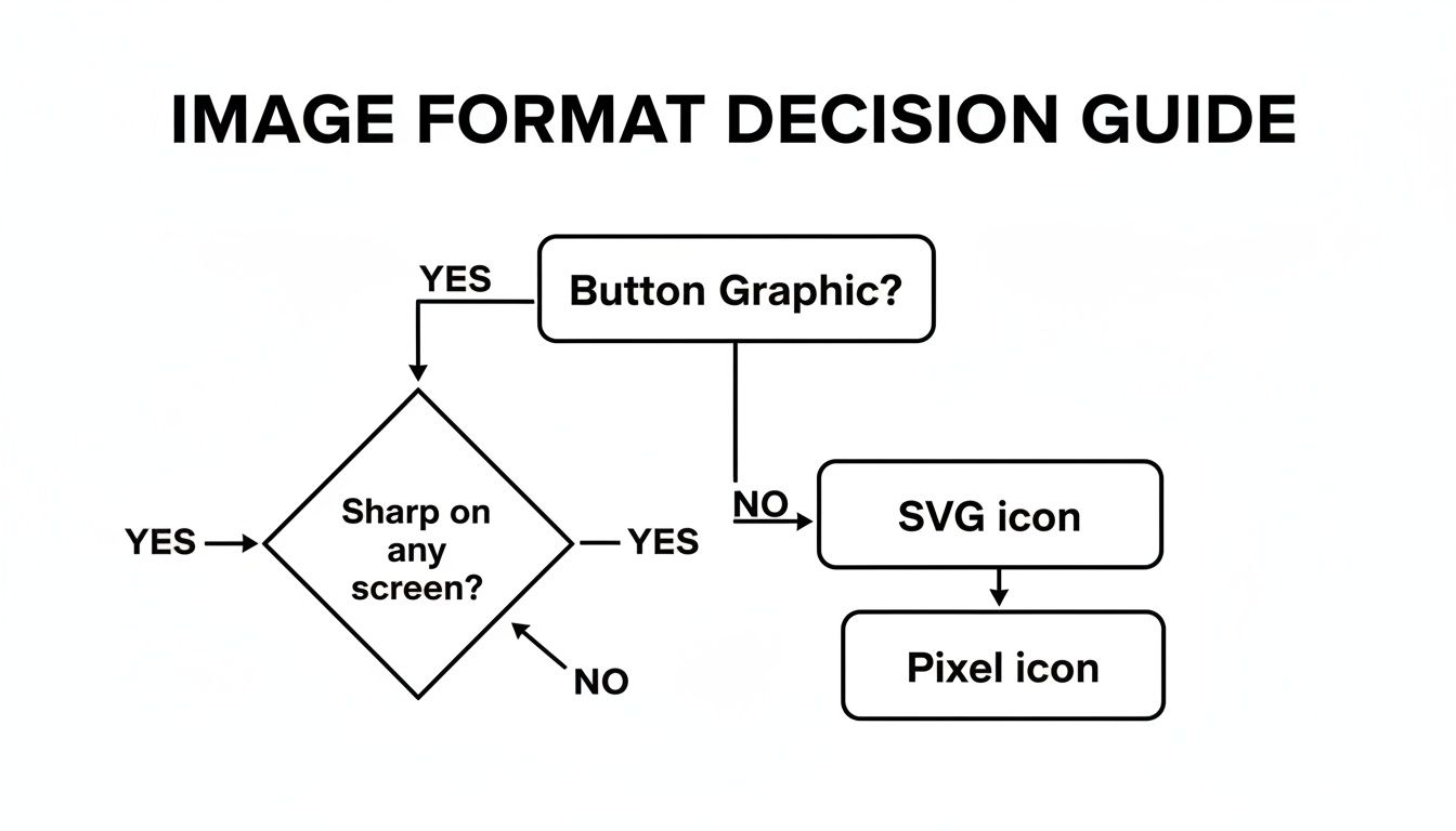
The bottom line? For simple icons that need to look sharp on any screen, SVG is almost always your best bet. For more detailed, photographic-style buttons, a high-quality pixel format like PNG will do the trick.
Tracking Clicks for Deeper Learning Insights
Here's the killer feature of using a dedicated platform: the data. Every single click becomes a data point. You can see which paths learners take, where they pause, and what resources they use. This is an absolute goldmine for making your training more effective.
By looking at click patterns, you can spot common misunderstandings. If 90% of your learners in a leadership course click the button for "De-escalation Techniques" over "Assertive Communication," that's a huge signal telling you exactly where to focus your next training initiative.
This level of insight is invaluable. While research often focuses on marketing, the principles are the same: a Wyzowl study found that 87% of people were persuaded to buy after watching a demo video—and those demos are packed with clickable elements. The same engagement drives learning and retention in a corporate setting.
Platforms like Mindstamp make this whole process incredibly easy. If you want to jump right in, we have a detailed guide on how to use clickable images on your videos. By using a tool built for this, you get to spend your time on instructional design, not on debugging code.
Designing Buttons Learners Actually Want to Click
A great image button is more than just a pretty graphic. In a training context, it's a critical signpost, guiding learners through their journey. To make buttons that work, you have to lean on solid UX/UI principles that put clarity and ease of use first. This isn't just about looking good; it's about making the whole learning experience feel effortless.
One of the first things to get right is visual consistency. Your buttons should feel like they belong to your training module. Stick to your company's color palette and fonts. This creates a cohesive look that reinforces your brand and, more importantly, builds trust and helps the learner stay focused on the content.
Making the User Experience Intuitive
When you're picking icons, think universal. A gear icon for "Settings" or a question mark for "Help" are instantly understood by almost everyone. They don't require any mental gymnastics from the learner. Getting too creative here can backfire, causing confusion and hesitation—exactly what you want to avoid in a training scenario.
Color contrast is another absolute must-have. The text and icon on your button need to stand out against the background. This is crucial for readability, especially for users with visual impairments. Plenty of free online tools can check your color combinations against accessibility standards, so there's no excuse for getting this wrong.
The real goal here is to make interaction second nature. A learner should never have to pause and wonder, "Is this clickable?" or "What happens if I press this?" Every design choice should point them clearly and efficiently toward their goal.
Size and Placement for Real-World Use
Let’s talk about the physical side of things. With so much corporate training happening on mobile devices, your buttons absolutely have to be 'thumb-friendly.' That means making them large enough to be tapped easily on a small screen without the user accidentally hitting something else. A good rule of thumb is to make touch targets at least 44x44 pixels.
Whitespace—the empty space around your buttons—is just as important. Giving your buttons room to breathe makes them stand out and keeps the interface from feeling cramped. This is especially true when you have several buttons grouped together, like in a quiz or a branching scenario. These same principles of clarity and spacing are vital in other areas, too. If you're building forms, for example, it's worth brushing up on lead capture form best practices to ensure every element is effective.
Ultimately, interactive video with well-designed image buttons is changing the game in corporate training. And the demand is there: 86% of high earners and 85% of digital-first consumers are asking for more interactive video experiences. Platforms like Mindstamp are giving L&D teams the tools to build these engaging modules and see measurable learning outcomes. You can discover more insights about video marketing statistics on thedesirecompany.com to see just how big this trend has become.
Common Questions We Hear About Image Buttons
When instructional designers and L&D managers start exploring interactive training, a few key questions always come up. Let's tackle them head-on so you can build your content with confidence.
One of the biggest concerns is always accessibility. How do you ensure every single employee can use your buttons? It boils down to providing a text alternative. If you're hand-coding, this means using semantic HTML like the <button> element and including descriptive text that screen readers can announce. In a platform like Mindstamp, this is typically handled with a simple "alt text" or "label" field.
Picking the Right Format and Proving Your Success
Another thing people often ask is which image format is best for training materials. The choice between SVG, PNG, or JPG comes down to your button's design.
- SVG (Scalable Vector Graphics): This is your go-to for simple icons and logos. SVGs are tiny files that scale perfectly on any screen without getting blurry, ensuring a professional look.
- PNG (Portable Network Graphics): Need transparency? Use a PNG. They're perfect for buttons with complex shapes where you don't want a solid background.
- JPG (Joint Photographic Experts Group): This format is really only for buttons that use actual photographs. Just remember, JPGs don't support transparency and can look rough if over-compressed.
For most corporate training, SVG is the clear winner. Its scalability and tiny file size lead to a faster, more reliable learning experience for your employees, no matter what device they're on.
Finally, we get to the question that every L&D professional eventually asks: "Can I actually track if people are clicking these?" Yes, you absolutely can. This is where tools built specifically for interactive video really shine.
Platforms like Mindstamp aren't just for adding buttons to a video; they give you detailed analytics on every single interaction. You can see precisely which options learners are choosing, spot where they might be getting confused, and get a real measure of engagement. This data turns your training from a one-way broadcast into a powerful feedback loop, letting you improve your content based on how employees actually use it.
Ready to see how interactive video can transform your corporate training? With Mindstamp, you can easily create engaging, trackable learning experiences that deliver measurable results. Explore Mindstamp's features and start your free trial today!
Get Started Now
Mindstamp is easy to use, incredibly capable, and supported by an amazing team. Join us!


Try Mindstamp Free


