How do I change the color and design of text interactions?
Short answer
Set the defaults in Design > Text: background color, text color and roundness. Then open one text interaction and use its Styling tab to change its own colors, border radius, font size and alignment. New text interactions start with the Design defaults.
How to do it
Copy link to How to do it- Open the video and select Design in the left menu.
- In the Text section, set Colors (Background and Text) and Roundness.
- Go back to Interactions and select a text interaction on the timeline.
- Open the Styling tab.
- Change Colors (Text and Background), Border Radius, Font Size or Alignment for this interaction only.
- Play the video in Preview and check the text over the lightest and darkest frames behind it.

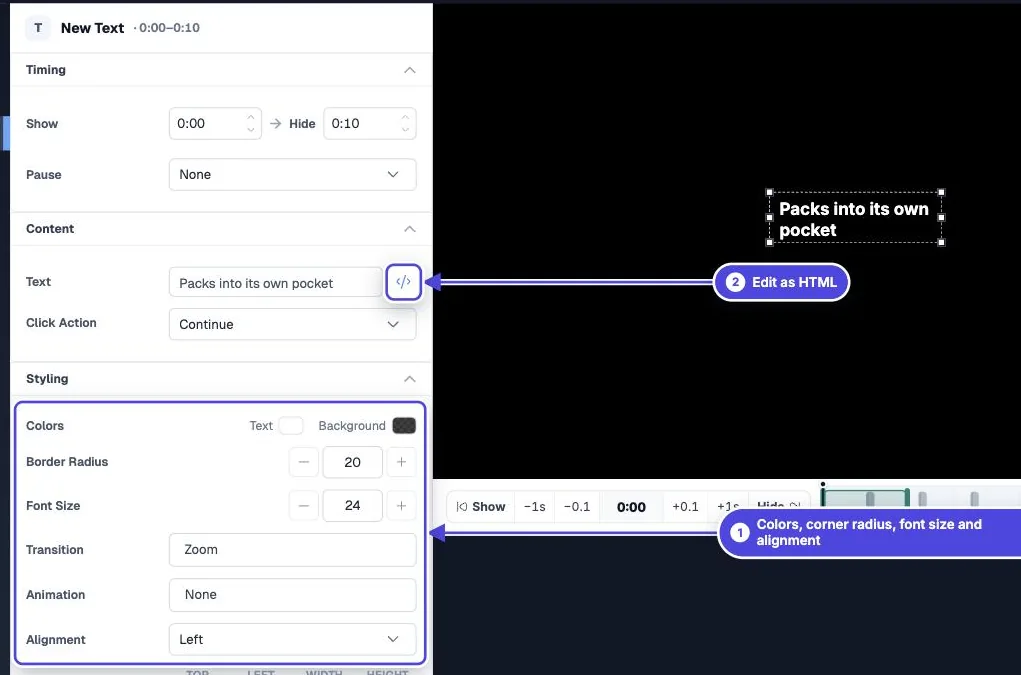
Defaults and exceptions
Copy link to Defaults and exceptionsThe Text section of Design sets the starting look for text interactions. When you add a new text interaction, it takes these colors and this roundness. Changes on the Styling tab apply to that one interaction and do not change the defaults.
Set defaults for every video from Branding in the side menu. A group or a single video can then override them. The Customized label on a Design section shows where a video no longer follows the account or group design.
Change existing interactions to match a new design
Copy link to Change existing interactions to match a new designChanging the defaults does not restyle text interactions you already made. To update them, open Design at the account or group level and use Apply to videos…. Select Restore all interaction styles to overwrite every interaction style on those videos. If you leave it clear, only styles that still match the old design are updated.
Formatting inside the text
Copy link to Formatting inside the textFor bold words, line breaks, headings, lists or icons, open the Content tab and select Edit as HTML. The editor has Insert Icon for icons and a live preview. See the HTML guide linked below for the tags you can use.
Keep text readable
Copy link to Keep text readable- Use an opaque or near-opaque background. Video frames change, so a transparent background that works in one scene can fail in the next.
- Keep strong contrast between the text and its background.
- Check the text on a phone. A font size that fits on a laptop can wrap or clip on a small screen.
- Do not use color alone to carry meaning, such as red for wrong. Add a word as well.
Viewer comments
Copy link to Viewer commentsOlder help articles called text interactions "comments". Viewer comments are a separate feature: viewers add them with the Add comment button when Allow viewers to add comments is on. They go to your reports and never show in the player, so the Text design does not apply to them. See viewer comments.